Research and Planning

Monday, 30 September 2013

Magazine Review


The magazine's masthead which is shown at the top of the page, below the images on top. 'Total Film' which is the magazine masthead is in bold and red font which is a typical font used by many film magazine such as Empire. But the difference between the two magazine would be that the masthead is behind the main image as this magazine wants its real focus on the main image. The main image grabs the audience attention particularly males as Megan Fox, a well known actress in the film industry is dressed in a cheerleader outfit. The image is portrayed as revealing and promiscuous because of her body language and the way she is posing. The magazine wanted to focus on the main image as the cover lines font sizes are very small, whereas the large image in the center captivates the audience as she gives the audience a direct mode of address. It also includes a variety of other images which is not very conventional as many film magazines such as Empire place the variety of other images at the bottom of the page. This has replaced the skyline in this magazine.

The other images which replaced where a skyline is usually is shows stills of other films that are out in cinema right now but it could be exclusive images from films that haven't been released yet which may catch the reader's attention as they want to know which film they are previewing. The color scheme of this magazine is mainly white, blue and red and Megan Fox reflects the color blue which she is wearing. The red may symbolize the blood and death in this film 'Jennifer's Body' but this a typical color to use for horror film magazines however the colors grab the audience attention as it's very bright and it fits well with the white background.

The audience for this magazine due to its main image and other features on this magazine would be males because of the image this magazine has used. Also the other images they used had two males in it and a futuristic car or machine and many males tend to love car's and futuristic films such as Tron so this may appeal to them. Also the layout of this film magazine is very high school and this may be their theme as the main cover lines typography is similar to high school lettering etc.

MoodBoard: Film Magazines

Film Magazines
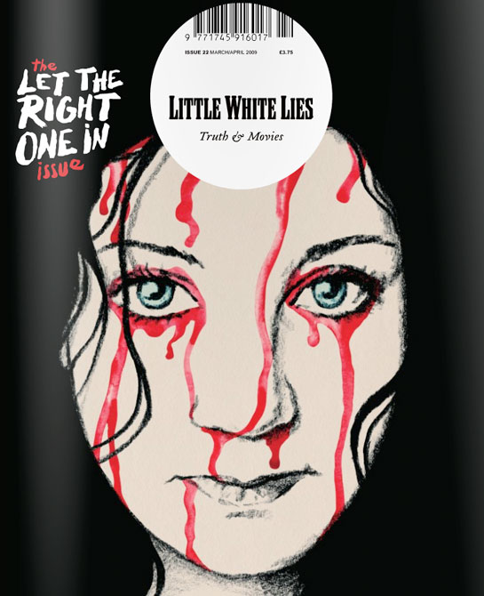
I have looked at a range of different film magazines such as Little White Lies, Empire and Total Film that will help me understand the codes and conventions of a film magazine so that I will be able to create my own film magazine that features my film. Each film magazine is very different from one and other and has a USP. For example Little White Lies features only one film whereas film magazines such as Total Film features one mainstream film but then their cover lines talk about other films that are out now or coming soon. Therefore Little White Lie's is very unique and this is there USP as no other film magazine is quite like them. It also uses an animated image of the main character of the film they are featuring so that it appeals to a mass market. For example they may be aiming at kids as they are interested in animation.

Total Film features a range of mainstream films and this is constructed like a typical magazine as it has a skyline, main cover lines, other images and plug's. Therefore it appeals to a larger audience because it features typical conventions of  a film magazine.

Sunday, 29 September 2013

Conventions Of A Film Magazine(Little White Lies)

Little White Lies

Little White Lies is a film magazine and they decided to use 'Let The Right One In' as the front cover of the magazine. Little White Lies is known for being an independent magazine that focuses on one film for each issue they make which is very different from other film magazines.

Firstly, the main image of the front cover of this film magazine is of the one of the main protagonist of the film 'Let The Right One In' but its an illustration of the girl and this is its USP(Unique Selling Point) as most of the issues feature an illustration instead of a real image and this differs from other magazines allowing the audience to be interested by this. The main image is of Eli from 'Let The Right One In' and she is giving the audience a direct mode of address and its a close up of the character. Also the blood is dripping down her face and this image isn't very lifelike as her eyes are crystal blue and blood is dripping down from her eyes. This automatically engages the audience as they are intrigue with this. Her black hair fades with the background as its also black however her pale face and the red blood is similar to the same colors used for the text.

The masthead and the barcode are in an unusual place and even how the barcode is printed. The masthead and barcode are in a round circle that is just above the main image and this very different as many magazines have their masthead at the top left and the barcode at the bottom right. Also Little White Lies is very simple and plain as it doesn't include main cover lines, skyline etc.


Saturday, 28 September 2013

Poster Analysis


The main image is a medium shot of one of the main protagonist in the Horror film 'Insidious'. Before even watching the trailer, audience can immediately know that the young boy has been somewhat possessed as his eye color is very unusual. This image then links to Levi Strauss theory on 'Binary Oppositions' of child vs evil as he seems like he was the victim but he was then slowly possessed by other evil forces. Also the complexion of his face matches the color of the poster. Also the house behind him could be the main location of the film as its an establishing shot, in addition the dark shadows around the house and this suggests that something sinister is happening in the house.

The poster's color scheme is very dark and very grey and this challenges the conventions of a horror poster but the cloudy thunder-storm suggests that something dangerous will happen.

Insidious typography color is in red and then then suggests that the genre is horror.

Friday, 27 September 2013

Analysis of Film Poster

Carrie


Carrieposter.jpg
Carrie(1976)


'Carrie' is a upcoming horror film the audience would immediately know that this is a horror film as it has all the expected conventions such as the billing block which is very common to have on every film poster. Above the billing block it says its based on the novel by Stephen King. Stephen King is known for writing gruesome and scary novels and this can make the audience want to watch the film. Firstly, the main image of the film poster is Chloe Mortez who is covered in blood, which is dripping from her eye and her forehead. This connotes that the film may include several deaths or accident's as blood symbolizes danger and death.

Also the film's title is 'Carrie' and the main colour used is red and white, the colour red is portrayed as blood as it drips from the title. This has all the expected conventions of a horror film poster as the title is in red, the actress's name's and Chloe herself.  However it also subverts typical conventions of a movie poster as the title's film is on the bottom right, its usually at the center of the poster or the top left. The audience don't see much of Carrie's costume but it's the same colour as the background. Her facial expression is quite still and icy and this could represent that she has been through a lot in the film, with the blood dripping down her face.

The USP(unique selling point) of this film poster is the main protagonist Carrie who is played by Chloe Mortez who is famously known for being in successful films such as Kick Ass 1 & 2.

The main themes spotted in film poster is childhood issues which is a typical theme featured in many horror films because childhood is meant to represent our innocence and children shaping into adults. The main image is of a young actress in her early teens, who plays a young character still in high school.

Carrie is a remake and it was firstly filmed in 1976 and it was very popular. Their is a huge contrast between the two film posters. Firstly, it of course has a different actress featured in the film, it has two main images. Carrie's facial expression in the first image where she is wearing a light pink prom dress and a tiara. It appears as if she's prom queen as she is wearing a tiara to suggest that, also she is caring flowers. This is very unusual because of the modern day film poster, the audience don't see Chloe Mortez's costume but we see her icy expression and this other actress looks very happy. Prom dresses are usually associated in fairy tales and in films like Cinderella therefore its a shock to see her wearing a prom dress and this turns the fairy tale elements upside down as the events have changed. This contrasts with the image next to it, where her prom dress has changed colour. She is covered in blood and the audience expected this as Carrie is a horror film and it's bound to have include killings and blood in the film. 

Carrie's film title is very different from the modern film poster as it's font and style is wavy but this could relate to Carrie's roller-coaster in the film and how she changes her personality in the film. As both images in this poster show the same person but her having 'powers' as the subtitle in the film poster says changed her or prom changed her. This film poster tells the audience more of the narrative then the modern day poster.


Thursday, 26 September 2013

Analysis of a Movie Trailer(Carrie 2013)


This movie 'Carrie' is an upcoming horror film and it follows its typical conventions for the genre horror. The duration of the trailer is 2.33 which is very long and it showed the audience many parts of the film. The trailer told the audience the narrative of the film and this wasn't expected as many directors only show  important glimpses of the film.

Firstly,the film trailer begins with the mother of Carrie I presume, singing a lullaby very softly and shows the audience the establishing shot of the house. At first everything is ordinary as the mother is singing a Christian lullaby therefore she's a devoted christian as she is singing about her 'father'(god) but their was a background diegetic sound of a girl screaming saying 'let me out', the camera then pans away from the mother and focus on the door with the girl constantly screaming and banging on the door. This represent's the theme which is commonly used in horror films 'Childhood issue' as she is is shown isolated in her room and she is also being bullied by her vicious classmates in the shower room. Carrie isn't an ordinary teenager and she says this herself 'I want to be normal'.

This film trailer includes supernatural themes as Carrie is shown developing powers and her mother is shown reciting the bible to Carrie and tells Carrie to 'pray'. Her mother is represented at first as a devoted and normal Christian but the audience gradually realize that she is fanatic and believes her daughter is a sinner as she tells her to pray for forgiveness. The mother is shown carrying a weapon, a knife twice in the trailer and it looks as if she's protecting herself from her own daughter.

Sound:both non diegetic and diegetic sounds were used in this film. The sounds used were very loud and dramatic as you could hear Carrie screaming and the sound building up which created suspense. However there was constant screaming the film trailer as so many scary events kept happening. For example the prom scene in the end. The screaming was very typical as this is a horror film and its very much expected/

Editing:  There are many fades in the trailer when it shows the audience the text then back to the characters which gives off a sense of continuity. The Jump cuts, which is a common editing technique is used throughout the trailer creating an effect on the audience, as its very thrilling for them as it puts them on the edge. The trailer speeds up in the end.

Camera Angles:  The Carrie trailer mostly uses medium or close up shots of each character and some establishing shots of the setting. The medium shots are commonly used in films and it shows us the detail of each character and its matched well with the long shots used in the trailer. The close ups is an important element in this trailer as it allows the audience to gain a feel of the character, for example when Carrie is shoved by her mother in her room.

Theories
Todorov Propp's theory of narrative isn't very clear in this film trailer of Carrie. Carrie may be the main protaganist but she could also be the antagonist(the villan).

Main Themes
Religious 
Supernatural
Childhood issues
Madness
Revenge


Scream 4: Analysis Part 2

Editing 

The Scream 4 trailer uses very conventional editing as the trailer uses a variety of fast paced and fast shots from shot to shot. This builds a large amount of suspense and thrill for the audience as they are trying to find out who the victim and the killer are. Throughout the trailer the audience see the masked antagonist and they see the killer stab the victims but they never show an actual kill leaving the audience to be left intrigued to who survives.


Scream 4- Analysis Film Trailer


To gather more research on Horror film trailers, I looked at an existing Horror film trailer 'Scream 4' which is an 2011 American slasher film and its the fourth film of the franchise. The genre of the film is Horror and from the start of the trailer to the end it provokes fear through the idea of the antagonist killing the characters.
The trailer follows codes and conventions of a typical slasher and horror film which is seen through mise en 
scene, camera shots, editing and sound

Mise en scene

The lighting as expected is dark but some characters are lit with a bright light but the background behind these characters is dark. Therefore this somehow draws the audience in as they focus on each character, but the audience can automatically indicate who the main protagonist as as somehow the lighting is much brighter on this character then the other characters. 
Mise en scene part 2

The location   of the film indicates its set in a small town and this increases the audience's fear even more as the film trailer looks realistic as the location may seem familiar to the audience. Also small town's are usually seen as safer locations then living in a big city. People would expect there to be killers loose in a big city rather then a small town. Therefore by placing the protagonist of a horror movie in a small town would break down the wall of a 'expected safety'. Also the audience usually relate to small towns and that is why most horror film's are set in a small town. However when I create my film trailer, setting my film in a small town is a better solution then setting it in a big city but as I live in London and not America, it isn't possible for me to do this. 

Mise en scene part 3
The antagonist's costume has become very iconic and the idea that anyone can buy his costume and the mask of scream creates a large amount of fear. The mask of scream is in black and white which blends with the dark lighting and the bright lit of each character which suggest any one of each of these characters could be the killer. If the audience have watched previous scream films they would know that the females who are wear revealing costumes are usually the characters who are killed the first. For example there was a medium shot of a girl getting dressed and she showed her brightly colored underwear and bra which follows Laura Mulvey's male gaze theory  . This shows that women who are shown as vulnerable tend to be killed first. 

Mise en scene part 4
There is a variety of shots included in this trailer but the trailer mostly used close up shots, medium shots and long shots. Long shots were used to see the setting of where the characters were placed. Also titled camera angles were used when the girl is being attacked by the killer and this allows the audience to be terrified. There was an high angle shot used as well to show the women falling on top of the van and this could represent  the killer breaking the conventions. Also the trailer shows technology is adapting alongside the adaption of the horror/slasher genre as when one of the characters looks into the webcam the killer planted, showing the perspective of the webcam. This then again increases realism and how the technology is somewhat promoting the killer. Also it shows how the killer has changed conventional horror. There are even quotes said by the characters such as 'the unexpected is the new cliche' and this means that the horror genre is adapting. 


Wednesday, 25 September 2013

Understanding Genre


The definition of genre is the classification of any type of media text that are classed into types or categories. Each genre can be identified by conventions that allow the audience to recognize what type of genre it is. For example the audience would immediately know that their watching an horror film if it includes the a scary antagonist.
Film genre's must constantly evolve otherwise they would become very repetitive. That is why there are sub genre's as if they didn't have sub genre's plot's would be very similar and it would get very dull for the viewers. Sub genre's can develop a response in a movie that pushes the genre and this makes it successful, and it can cross traditional genre boundaries

 Robert Warshow (1948) a theorist who analysed popular film genre's and he defined genre as a reflection of society therefore his theory suggest that in genres in particular horror; the audience see conflicting ideologies (belief systems) in society through their plots and characters. However there are contemporary genre theorist's that define genre in a different way such as Rick Altman and Will Wright.

 Rick Altman has a different view to Robert Warshow who's a traditional theorist for genre. He believed that particular genre's held a ideological message and followed typical generic patterns. For example Horror conventionally include a lone survivor in the ending and typically begins with someone dying. Another example that is the genre romance always equates to a happy ending.

 Similar to Altman's theory, Will Wright believed the genre told the story about itself as the conventions and the expectations allowed the audience to know what will happen in the narrative.

The genre I have chosen is Horror, and I have to create a trailer, film poster and a front cover of the magazine. Horror films are designed to frighten and increase the audience's worse fears, and they are often terrifying and scary but it still entertains the viewers. Horror films feature a variety of different styles from the earliest silent films Nosfearatu, to today's modern films that use CGI. However horror films are often combined with science fiction as they feature deranged humans and monsters. There are many sub-genre's of horror: slasher, teen terror, serial killers, satanic and Dracula. As I have chosen Horror, I will have to research other horror films and compare them so that I would be able to create my trailer and the promotion package. In addition, I will also learn the codes and conventions of Horror films so that my film could be generic however, I want to make my film different as well, and not to make it too generic.


Rick Altman
Will Wright